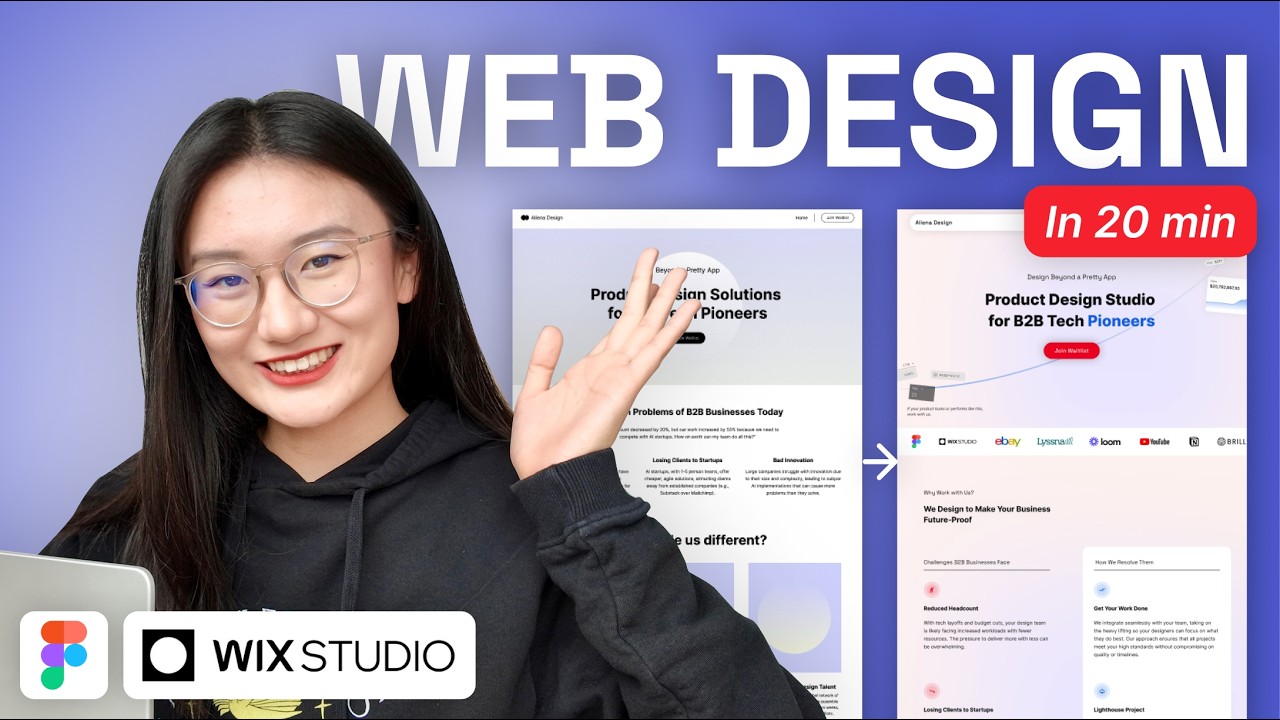
Start by studying fundamental design elements like color theory, typography hierarchy, layout grids, and visual balance. Use free resources to understand how these create cohesive pages.
Review principles from Tilda Education: choose harmonious colors, select 2-3 fonts for readability, use grids for alignment.
Practice sketching wireframes on paper to internalize spacing and flow.
Why this step matters:
-Builds a strong visual foundation essential for all designs
-Enables creating balanced layouts for real-world projects
2-4 hours
Browser, Pen and paper, Tilda Education course
$0
Definition of Done
•Can identify primary, secondary, accent colors
•Explain typography hierarchy in own words
•Sketch a basic wireframe with grid
Common Mistakes to Avoid
❌ Using too many fonts overwhelming the design
→Limit to 2-3 fonts: one for headings, one for body
❌ Ignoring color contrast for readability
→Test with tools like WebAIM Contrast Checker
2
Following along, or just reading? 👀
Spin up a personalized “learn landing page design” plan you can save, check off, and return to anytime — unlimited on the free trial.