Understand Constraints
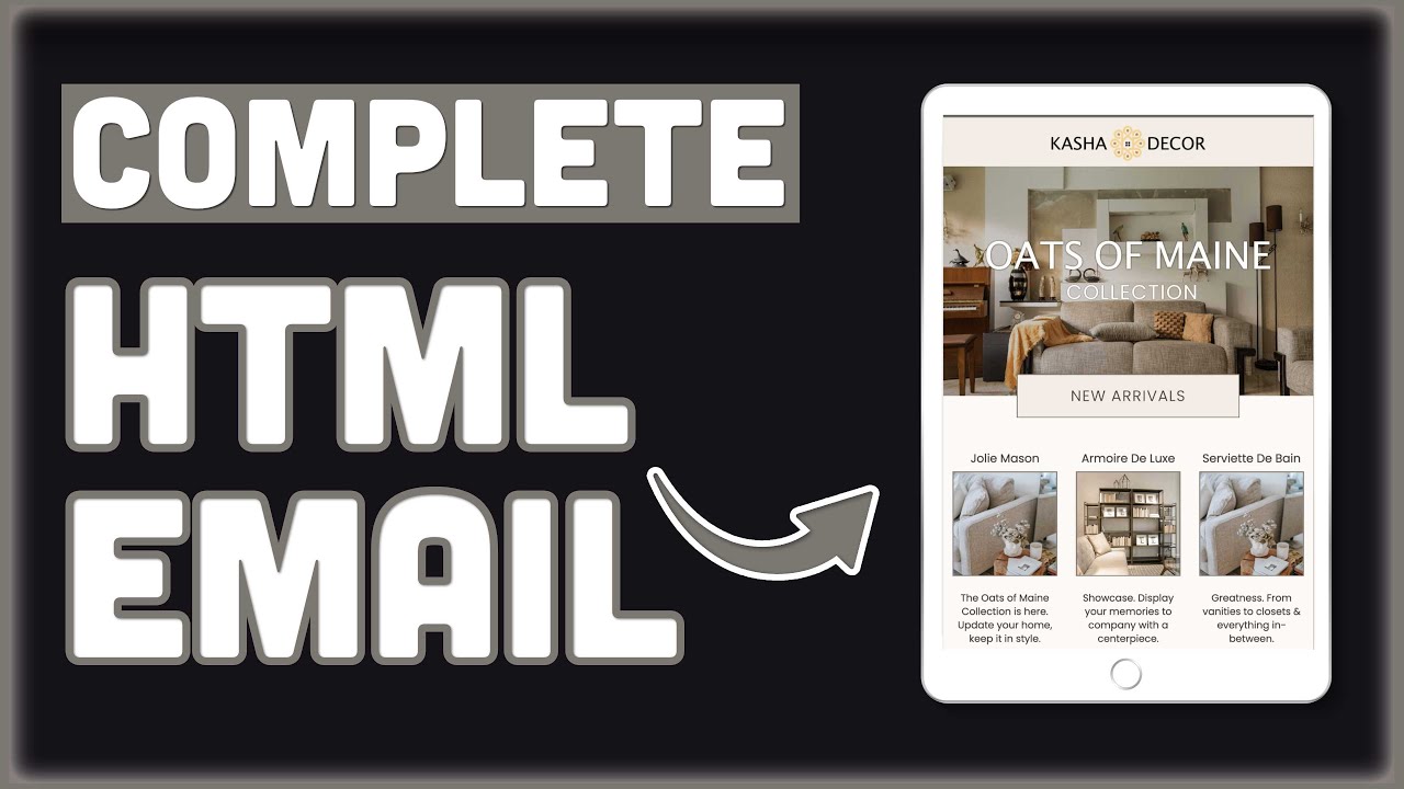
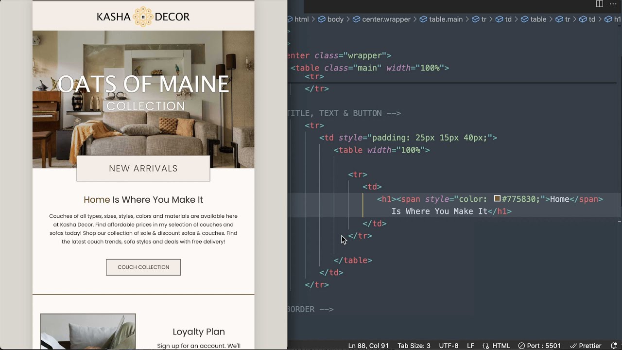
HTML emails differ from web pages: limited CSS support, no JavaScript, table-based layouts, inline styles required.
Key Resources
- Read Can I Email cheatsheet for CSS/HTML support.
- Study Litmus Foundations of Email Design: 600px width, sans-serif fonts (Arial, Helvetica), alt text on images.
Practice
Open VS Code, create basic.html:
<!DOCTYPE html>
<html>
<head>
<meta charset="UTF-8">
<meta name="viewport" content="width=device-width">
</head>
<body style="margin:0;padding:0;">
<table role="presentation" width="600">
<tr><td>Header</td></tr>
</table>
</body>
</html>
Inline CSS manually.